Léargas - a branding challenge…
I was approached by the Communications team at Léargas to tackle what I think is my most complex brief to date. Léargas is a stand-alone company that runs many sub-programmes - notably Erasmus+ and European Solidarity Corps.
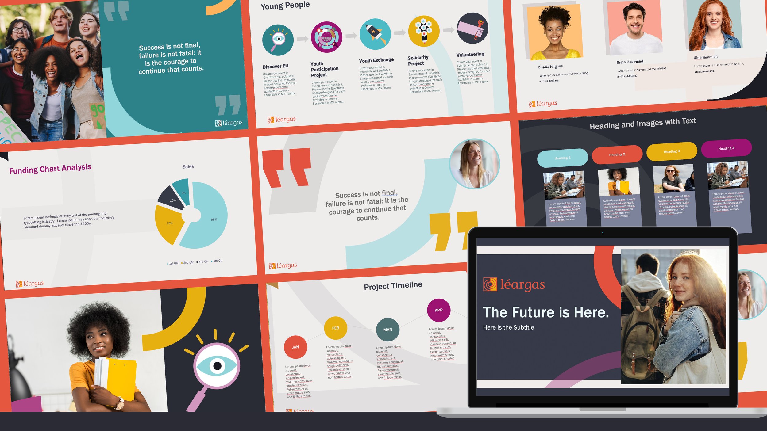
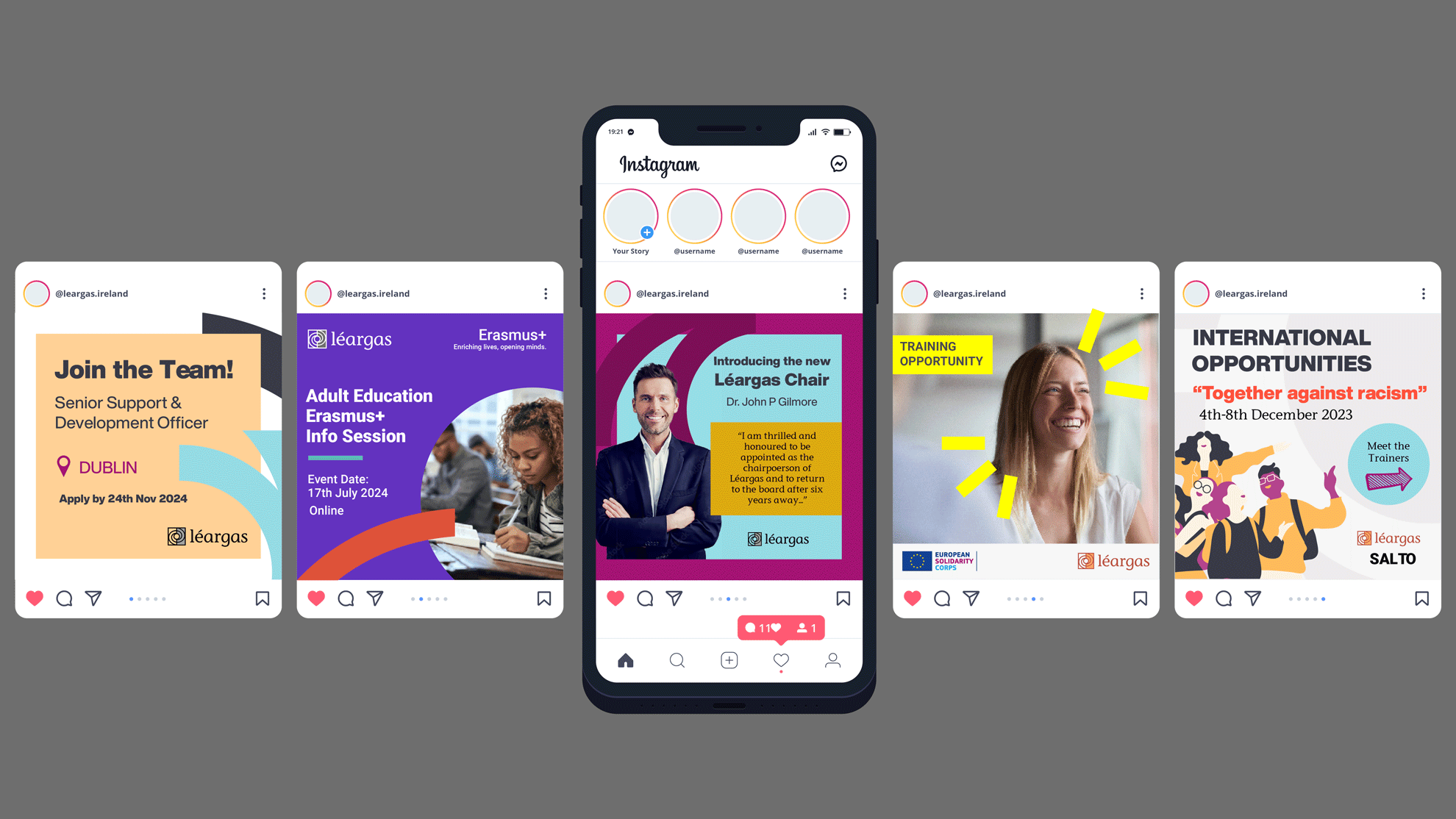
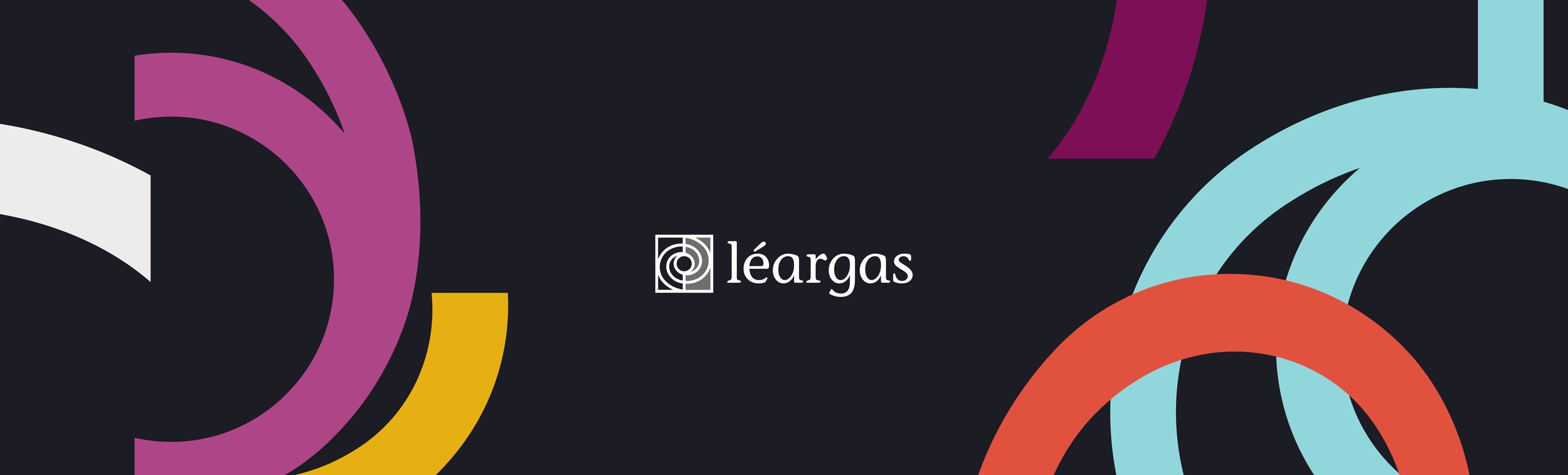
The brief: To create a distinctive brand for Léargas that would not get confused with the branding of their sub-programmes, but at the same time be able to exist alongside them harmoniously. I had to also take on board that the assets created would have to be editable and transferable, as they would be used by members of the company on a wider scale than just the Communications team.
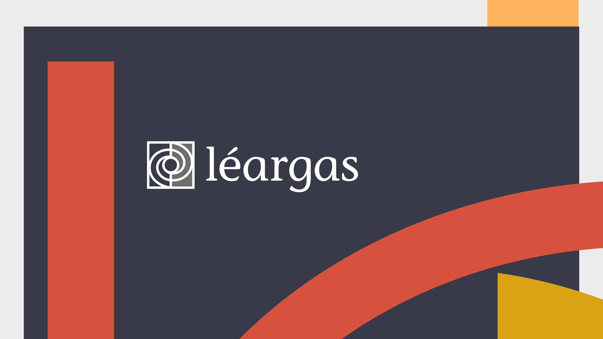
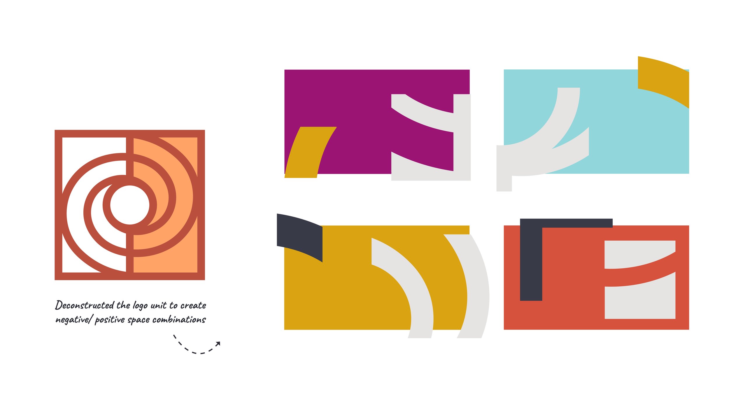
Solution: I defined the Léargas colour family and fonts, but ensured that it would work alongside the branding of the sub-programmes. I re-coloured the existing illustrative icons to suit the new colour scheme and created distinctive shapes using the Léargas Celtic knot unit. This provided a vast array of assets that could be used in various combinations indefinitely.